Extended Family Tree Template (Siblings, Aunts, Uncles, Cousins)
A standard family tree shows your direct line — parents, grandparents, great-grandparents — and leaves out almost everyone you actually spend Christmas with. No siblings, no aunts or uncles, no cousins. An extended family tree adds those sideways relatives back in, which makes it far more recognizable as your family and considerably harder to lay out, because every sibling added to a generation widens the whole chart beneath it. This page covers what to include, how to arrange it so it stays readable, and where to sensibly stop. To name any relationship you are unsure of before plotting it, use the cousin calculator.
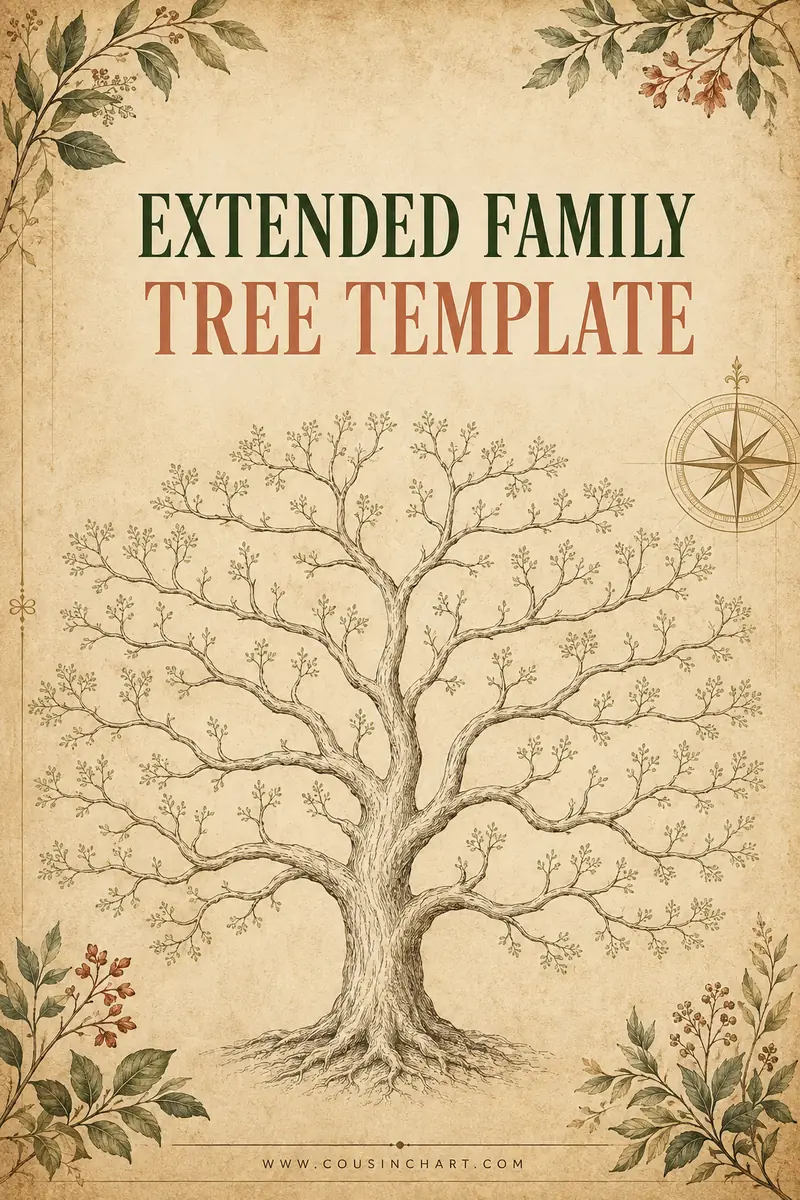
Free printables for this page
Download a blank PDF (US Letter or A4) — free, no sign-up — or customize it in the maker above before printing.
 Extended Family Tree
 Family Tree With Siblings
 Descendant Chart
Who are you adding? Tap the group and see where it goes.
Tap a group above. Every sibling you add widens everything beneath them.
Direct line versus extended
The distinction that decides how big your chart becomes.
A direct-line (pedigree) chart shows only the people you descend from. Two parents, four grandparents, eight great-grandparents. It doubles each generation but stays entirely predictable, and four generations fits comfortably on one sheet.
An extended chart adds everyone in those generations — your parents' siblings, your grandparents' siblings, and all of their descendants. There is no formula for how large that gets, because it depends entirely on how many children each couple had.
The practical difference is dramatic. A direct-line four-generation chart has fifteen people. The same four generations extended, in a family averaging three children per couple, runs to well over a hundred.
Which is why the useful question is not "can I fit everyone" but "who is this chart for". A chart meant to show a child how the family fits together needs cousins. A chart tracing a surname back two centuries does not.
Where each group sits
The layout rules, which are consistent and worth learning once.
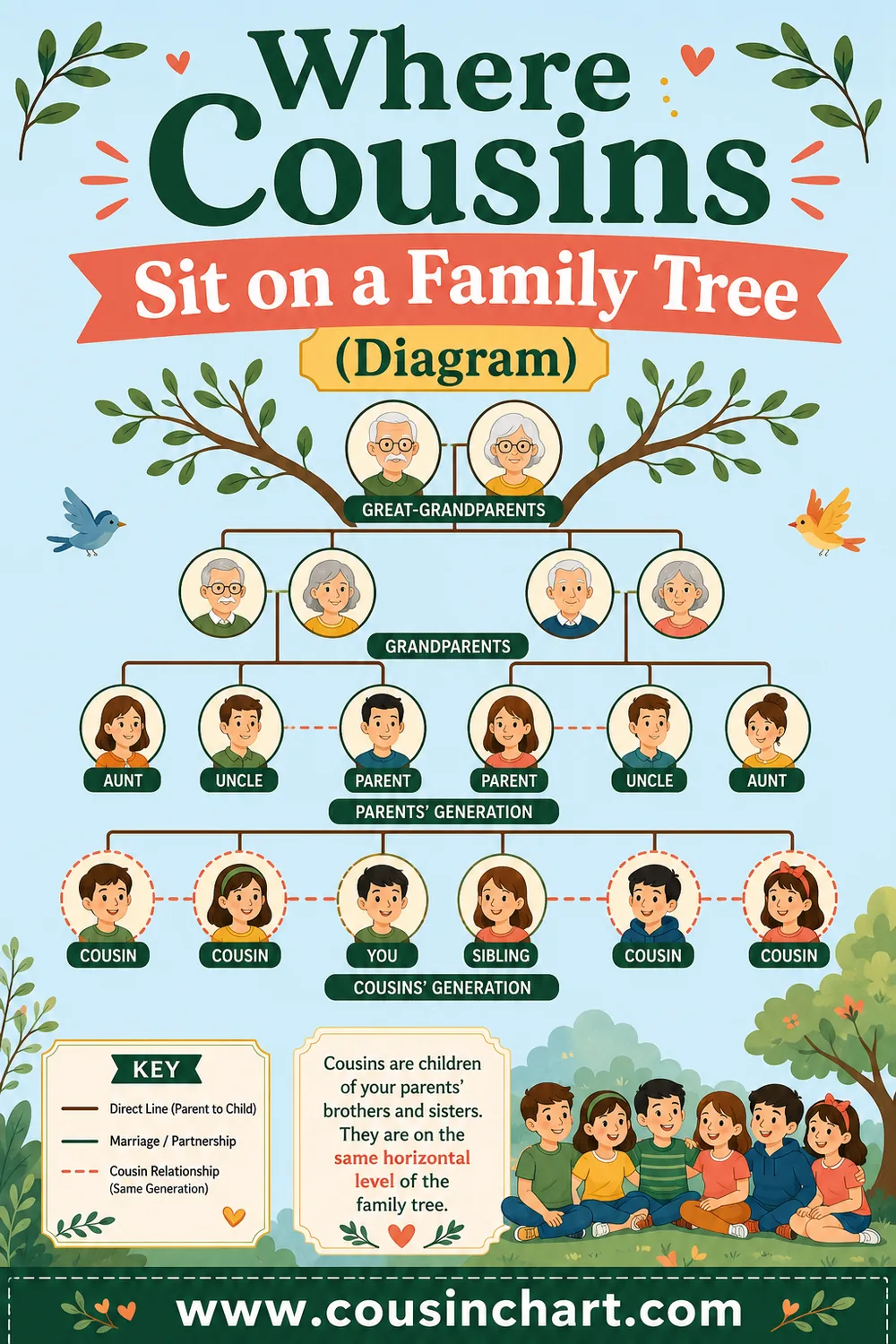
Siblings go in your own row, hanging from the same horizontal line beneath your parents. Oldest on the left — this is a real convention and readers assume it.
Aunts and uncles go in your parents' row, hanging from your grandparents' line. Your parent sits among their siblings in birth order, which frequently means your parent is not in the middle.
Cousins go in your row, hanging beneath their own parents. This is where charts get wide: each aunt or uncle brings a cluster of children directly into your generation.
Great-aunts and great-uncles go in your grandparents' row, hanging from your great-grandparents' line — and their descendants become your second cousins and first cousins once removed.
Spouses sit beside their partner, joined by a short horizontal line. Married-in relatives are not blood relatives, and some charts mark them with a different box style to make that visible.
And the rule underneath all of it: children always hang from the union that produced them, never from a parent as an individual. Get that wrong and the chart misleads about who belongs to whom — which matters most in the blended cases covered in blended family tree template.
How wide it gets
Worth seeing before you start, because it determines the format.
| What you include | 3 generations | 4 generations |
|---|---|---|
| Direct line only | 7 people | 15 people |
| + your siblings | ~10 | ~18 |
| + aunts, uncles, cousins | ~30 | ~45 |
| + their spouses | ~45 | ~70 |
| + great-aunts and second cousins | ~70 | 150+ |
These assume around three children per couple. A family averaging six doubles every figure.
The jump that catches people is cousins. Adding aunts and uncles alone is manageable; adding their children is what pushes a chart past one sheet.
A useful rule of thumb: three generations extended to first cousins is the largest chart that reliably fits on a single A3 sheet at readable size. Everything beyond that needs a bigger format, a split, or a different shape — the options are in family tree templates for large families.
Layout that survives the width
Practical choices that buy space without losing information.
Put the largest sibling group in the middle, not at an edge. A big family on the left pushes everything right and wastes half the sheet.
Center your own line. Your direct ancestors should run roughly down the middle, with aunts and uncles spreading either side, so the chart reads outward from you.
Stagger the rows. Offsetting alternate boxes vertically lets them sit closer together horizontally without the connecting lines colliding.
Abbreviate ruthlessly. "b. 1943" rather than "born 12 March 1943". Full dates triple the width of every box, and years are enough for a wall chart.
Drop the boxes entirely on the widest rows — names on short rules read just as clearly and take far less room.
Use landscape, always. The problem is width, and portrait makes it worse — and if the sheet still will not take it, a different shape may, as compared in family tree chart types.
And consider leaving spouses off the outer branches. You lose a little completeness and gain a great deal of room; a note on the chart explaining the omission keeps it honest.
Where to stop
The decision that separates a usable chart from an abandoned one.
First cousins and three generations is the standard stopping point, and it covers the people most families actually interact with.
Four generations to first cousins works if the family is small or you have A2 paper.
Second cousins roughly doubles everything again, and they are usually people you have met twice. Include them only if there is a reason.
One branch at a time is the alternative to stopping: chart your mother's side fully on one sheet and your father's on another. Two readable charts beat one unreadable one.
Deceased-only is another sensible cut, particularly for anything you plan to share, since it sidesteps the privacy question entirely.
Write your stopping rule on the chart itself — "descendants of William and Alice Hart to first cousins, three generations". It stops the chart from looking incomplete and stops you from being asked why someone is missing.
The relationships an extended chart reveals
Half the point of adding sideways relatives is seeing how they connect.
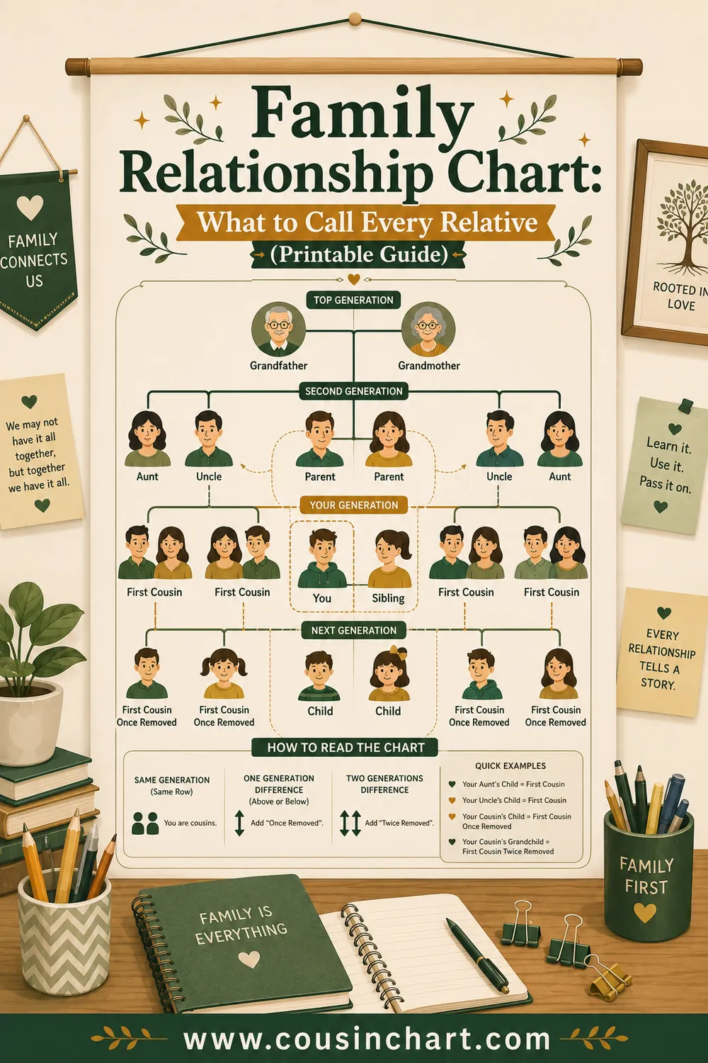
Your first cousins share a set of grandparents with you and sit in your generation.
Your first cousins once removed are either your parent's first cousin, or your first cousin's child. Same relationship name in both directions — the removal counts the generation gap, not the age difference.
Your second cousins share great-grandparents and are the children of your parents' first cousins.
Great-aunts and great-uncles are your grandparents' siblings, and their grandchildren are your second cousins.
Half-siblings, step-relations and adoptions all need marking distinctly, because a chart that renders them identically to full blood relations is inaccurate — and one that leaves them out is unkind.
If you lose track, the cousin calculator names any pairing from two dropdowns, and the layout of where each relationship sits is in cousins on a family tree with the naming system in family relationship chart.
Filling it in without stalling
The process that gets a chart finished rather than started.
Draw the structure first, in pencil, with no names. Just boxes and lines for everyone you intend to include. This is where you discover it does not fit, and it costs ten minutes rather than an evening.
Then add names only. No dates, no places. A chart with every name and no dates is useful; one with half the names and full dates is not.
Then add years. Birth and death years, abbreviated.
Then anything else — places, marriage years, notes.
Work outward from yourself, not down from the oldest ancestor. You know your own generation best and the information gets thinner as you go up, so starting where the facts are certain means the uncertainty accumulates at the edges rather than the center.
Mark uncertainty with a question mark rather than leaving a box empty. "John? b. c.1890" records what you know and flags what you do not.
And ask the oldest relative you have access to, early. The most common regret in family history is not asking sooner — the questions worth asking are in printable family tree if you want a structure to work through.
Common mistakes
Starting without deciding where to stop. The chart runs off the page and gets abandoned.
Hanging children from one parent instead of the union. Misleading in any family, seriously so in blended ones.
Ignoring birth order. Oldest on the left is a convention readers rely on.
Putting the biggest sibling group at an edge, which wastes half the sheet.
Writing full dates. Years only on a wall chart.
Including spouses on every branch when the sheet cannot take it.
Treating step-relations as blood relations on a descent chart, without marking the difference.
Leaving living relatives on a chart you intend to post publicly, without thinking about it first.
And confusing second cousins with first cousins once removed, which is the single most common naming error and is worth checking rather than guessing.
FAQ
What is an extended family tree?
A chart that includes sideways relatives — siblings, aunts, uncles and cousins — rather than only your direct ancestors. It is far more recognizable as your actual family and considerably wider on the page.
Where do cousins go on a family tree?
In your own generation row, hanging beneath their own parents, who are your aunts and uncles. Adding cousins is the step that most widens a chart, because each aunt or uncle brings a whole cluster into your row.
Where do aunts and uncles go?
In your parents' row, hanging from your grandparents' line, arranged in birth order with your own parent among them. That frequently means your parent is not in the center of the chart.
How far should an extended family tree go?
First cousins across three generations is the usual stopping point and the largest chart that reliably fits one sheet at readable size. Second cousins roughly double it again.
Should I include spouses?
It depends on space. Including every spouse nearly doubles the box count, but leaving them out means cousins appear with only one parent. A common compromise is spouses on the inner branches only, with a note explaining it.
What is the difference between a pedigree chart and an extended tree?
A pedigree chart shows only people you descend from — two parents, four grandparents, and so on. An extended tree adds their siblings and descendants, so it grows unpredictably depending on family size rather than doubling neatly.
Decide the edge, then draw
An extended family tree is the version that looks like your actual family, and the price is width — every sibling you add spreads everything beneath them. Put your own line down the center, arrange siblings oldest-left, hang children from unions rather than individuals, and put the largest sibling group in the middle of the sheet. Then decide your edge before you draw: first cousins and three generations covers most families and fits most paper. Write that rule on the chart, and use the cousin calculator whenever a relationship name is not obvious.