Bow Tie Family Tree Charts, Explained (+ Template)
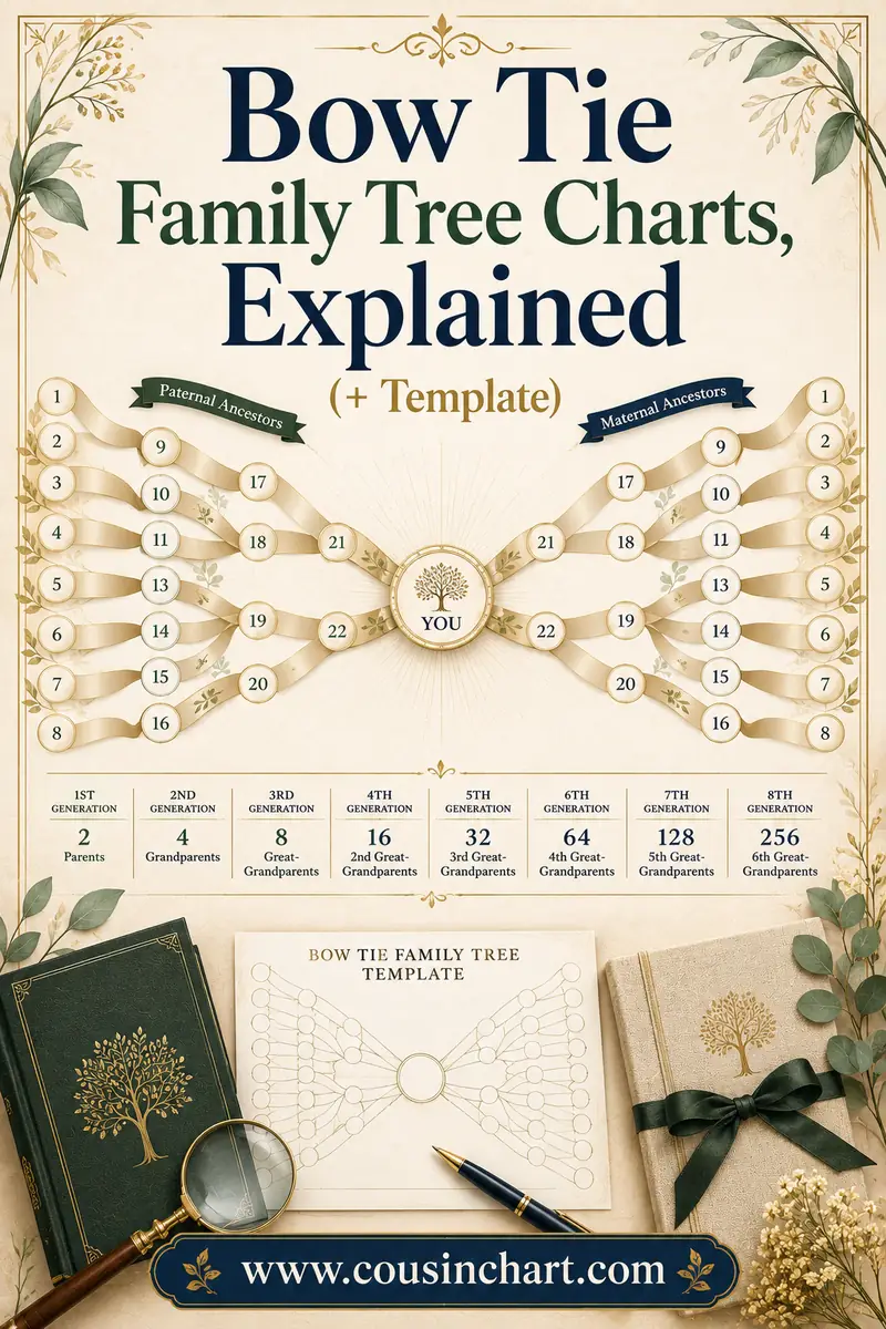
A bow tie family tree chart puts you in the center of the page with your father's ancestors fanning out to the left and your mother's fanning out to the right — two pedigree wings meeting at a knot, which is you. Same people as a standard pedigree chart, but the layout answers the question families actually ask first: which side is that from? One glance splits your entire ancestry into "dad's people" and "mom's people."
This guide covers how the layout works, the box math per wing, the wedding-gift couple variant (two whole families meeting at one marriage), how a bow tie differs from an hourglass chart, and print settings. A blank bow tie template is part of the free CousinChart printable pack — and for every "okay, but what's dad's cousin's daughter to me?" the chart provokes, the free relationship calculator has the answer.
Free printables for this page
Download a blank PDF (US Letter or A4) — free, no sign-up — or customize it in the maker above before printing.
 Bow Tie Family Tree
 5-Generation Pedigree Chart
 Cousin Relationship ChartThe classic cousin grid: 1st cousin, 2nd cousin, times removed.
Relationship quick-check: tap a phrase to see who they are — and which wing of the bow tie they'd sit in.
Tap a phrase above to see the answer.
Work out any family relationship →How the bow tie layout works
Take a standard pedigree chart — subject on the left, ancestors stacking to the right — and fold it around the subject. The father's branch swings left; the mother's swings right. What's left in the middle is you (the "knot"), flanked by two mirrored triangles of ancestors. Hence the name: drawn with its connecting lines, the whole chart looks like a bow tie lying on its side.
Each wing is a self-contained half-pedigree:
| Generations shown | Center | Per wing | Total people |
|---|---|---|---|
| 4 | You | 7 (parent, 2 grandparents, 4 great-grandparents) | 15 |
| 5 | You | 15 (adds 8 great-great-grandparents) | 31 |
| 6 | You | 31 (adds 16 3rd-great-grandparents) | 63 |
Notice the totals match a normal pedigree of the same depth — 15, 31, 63. A bow tie contains exactly the same ancestors; it just spends the page's width instead of its height, which is why it thrives on landscape paper while a deep pedigree chart fights it.
By convention the paternal wing goes left and maternal right, each wing reading outward — parents nearest the knot, oldest generation at the page edges. Within each wing, fathers ride the outer edge (top-left corner is dad's all-male line; bottom-right is mom's all-female line, the path mitochondrial DNA takes).
What the layout is actually good for
The "which side?" question. Every family sorts itself into sides — whose nose you got, which side the reunion is for, which grandmother's town you're visiting. A pedigree chart makes you trace lines to answer that; the bow tie makes it geography. Anything left of the knot came through dad. This is also the natural chart for explaining sides to kids: point to the wing, name the people.
Balanced-research display. A bow tie exposes lopsided research instantly — a lush left wing and a threadbare right wing is the most common sight in genealogy, and seeing it side by side is what finally sends people to work on mom's line.
One-page framing. A 4-generation bow tie sits beautifully on a single landscape sheet with the subject's name calligraphed at the knot. It's arguably the best-looking one-pager after the fan chart, and it beats the fan for writability since every box is rectangular.
The couple version: two families meeting at a marriage
The bow tie's most popular variant moves the knot: instead of one person centered between their own two sides, a married couple (or their new baby) sits at the center, with his entire ancestry as one wing and hers as the other. Two family trees, meeting at one wedding.
This is the genealogy world's favorite anniversary and wedding gift, for good reason — it's the only standard chart where both families appear as equals on one page. The math per wing is a full pedigree of the spouse: a 4-generations-per-side couple chart holds 14 ancestors per spouse plus the couple, 30 people total. Fill it in before the wedding using each family's rememberers, print on cardstock, frame it, and watch both grandmothers cry.
For a new baby, center the child instead: mom's family one wing, dad's the other, and the chart doubles as the cheat sheet for which of the baby's four great-grandmothers is which.
The bow tie as a DNA sorting tool
The bow tie's left/right split maps exactly onto the first question every DNA-match list forces: is this match from mom's side or dad's side? That's made it the unofficial worksheet of DNA genealogy, used two ways:
Sorting matches by wing. Print a bow tie, write your confirmed ancestors in, and as each significant DNA match gets identified, pencil their name at the edge of the wing they connect through — next to the shared ancestor couple if you've found them. Within a few weeks the chart becomes a physical index of your match list: this cluster of cousins hangs off the paternal wing's upper edge, that mystery cluster clearly belongs somewhere in the maternal wing's unresearched half. Testing one parent (or their siblings) supercharges this — any match shared with your father's kit belongs to the left wing, full stop.
Spotting the gaps DNA can see. Each wing's outer column is where ethnicity estimates and match clusters either corroborate the paper trail or quarrel with it. A maternal wing documented to the 1800s that attracts zero matching cousins is a polite hint worth investigating; a cluster of strong matches pointing at an "empty" part of a wing tells you which blank boxes to research next.
Two honest caveats. First, X-DNA and mitochondrial lines follow specific paths through the wings (the all-female bottom edge of the maternal wing carries mtDNA), so deep-DNA questions eventually need a proper inheritance chart rather than a bow tie. Second, a match's amount of shared DNA suggests a range of relationships, not one — "we share 100 cM and connect through the left wing" still spans everything from second cousin once removed to third cousin. That final step, turning a proposed shared couple into a named relationship, is precisely what the free CousinChart calculator does in seconds.
Bow tie vs. hourglass (people mix these up)
Both are "person in the middle" charts, so they get confused constantly. The difference is what's on the two sides:
- Bow tie: ancestors on both sides — split left/right by parent. No descendants anywhere.
- Hourglass: ancestors above, descendants below. The center person's tree runs both directions in time — grandparents up top, grandchildren at the bottom.
Use a bow tie to show where one person came from, sides separated. Use an hourglass to honor a patriarch or matriarch at a milestone birthday — their origins above, their legacy below. (An hourglass's bottom half is just a descendant chart, with everything that implies about unpredictable width.) The whole family of layouts — pedigree, fan, bow tie, hourglass, descendant — gets compared head-to-head in family tree chart types.
Filling in and printing the template
The free pack's bow tie template is a 4-generation, 15-box layout on landscape Letter/A4, with a 5-generation version that's happier at 11×17".
- Start at the knot — your name (or the couple's), then work each wing outward. Fill the near columns from memory; the outer columns are the usual phone call to the family rememberer.
- Maiden names throughout, as on every ancestor chart — the maternal wing dies fast without them.
- Landscape orientation, 100% scale, never "fit to page." The wings are sized to the page edge-to-edge; scaling shrinks the outermost boxes first, and those are already the tightest.
- Normal or better print quality — the long horizontal connector lines fade badly in draft mode.
- Cardstock (65 lb+) for gift versions; 28–32 lb paper for working copies.
- Color-tint the wings if the chart will teach as well as decorate — a pale warm wash over the paternal side and a cool one over the maternal side makes the split legible from across a room, and kids absorb the two-sides idea from the colors before they can read the names. Colored pencils over the printed chart work better than markers, which bleed through everything short of cardstock.
- Give the knot a line of its own. Under the center name, add birth date and place — the chart is implicitly "where this person comes from," and anchoring the knot in time makes the wings' dates readable as a progression.
- If one wing is mostly unknown, print anyway. A bow tie with a bare wing is a research plan with a frame around it — and honestly, the empty side makes the best conversation starter at the next family dinner on that side.
FAQ
What is a bow tie family tree chart?
An ancestor chart with the subject in the center, the father's ancestors extending left, and the mother's ancestors extending right — two mirrored pedigree wings meeting at one person. It shows the same people as a regular pedigree chart, arranged to separate the two sides of a family visually.
How many people fit on a bow tie chart?
Same as a pedigree chart of equal depth: 15 people for 4 generations, 31 for 5, 63 for 6 — half of each ancestor generation per wing. Four generations fit landscape Letter paper; five is comfortable at 11×17 inches.
What is a couple (wedding) bow tie chart?
A variant with a married couple at the center: one spouse's full ancestry as the left wing, the other's as the right. A 4-generation-per-side version holds 30 people and is a classic wedding or anniversary gift. Centering a new baby instead shows both parents' lines meeting in the child.
What's the difference between a bow tie chart and an hourglass chart?
A bow tie shows ancestors only, split left and right by parental side. An hourglass shows ancestors above and descendants below the center person. Bow tie answers "which side?"; hourglass shows one person's origins and legacy together.
Do siblings, aunts, or cousins appear on a bow tie chart?
Not on the standard form — it's direct ancestors only, like any pedigree layout. Some templates add the subject's siblings beside the center knot, but aunts, uncles, and cousins stay off-chart; a cousin chart or relationship calculator covers them.
Put yourself at the knot
Print the bow tie from the free CousinChart printable pack, write your name at the center, and race the two wings — most people discover within ten minutes which side of the family they actually know. Then take the bare wing as this month's assignment, and keep the free relationship calculator handy for every side-branch relative the wings can't hold.