Shared cM Chart: How to Read It and Narrow Your Match
A shared cM chart takes the amount of DNA two people share, measured in centimorgans, and shows you every relationship that amount is consistent with. You find your number, read across the row, and you get a list of possibilities — not one answer. Each box on the chart carries an average and a range, and because those ranges overlap heavily, a single figure like 1,700 cM fits four or five completely different relationships at once.
That's the chart doing its job correctly, not failing. Shared DNA measures closeness, and several relationships are equally close. The work of getting to one answer comes from age, family side, shared matches, and segment shape — the four filters this guide walks through. If you want the shortlist for your number right now, our shared cM calculator generates it instantly.
Narrowing a cM number down. Tap each step to see what to actually do:
Tap a step above.
Run your cM number through the calculator →What the Shared cM Chart Is
The chart everyone means when they say "the shared cM chart" is the Shared cM Project, a crowdsourced study started by genealogist Blaine Bettinger in 2015. Instead of relying only on theoretical expectations, Bettinger asked testers to submit their shared centimorgan totals for relationships they already knew were true — a documented aunt, a proven second cousin, a confirmed half sibling.
Tens of thousands of submissions later, the project produced something no textbook could: a picture of what real relationships actually look like in real databases, including how far from the average they wander. Version 4 of the project, released in 2020, is the version most tools now use.
The chart is hosted interactively at DNA Painter, where you can type in a cM number and get back a list of relationships with probability percentages attached, plus histograms showing how the submitted data was distributed. That interactive version is the one most genealogists reach for daily, and our DNA Painter guide covers its other tools too.
Two things the project is not. It's not an official product of any testing company, and it's not a set of hard limits — the ranges describe what has been reported, so a genuinely unusual result can land outside them. Treat the numbers as very good guidance, not physics.
How to Read the Chart: The Numbers in Each Box
Open the classic grid version and each relationship box shows you up to three things.
The average. The single most typical shared cM figure for that relationship. First cousins average about 850 cM. Useful for orientation, dangerous if you treat it as the expected value for your match.
The range. The observed low and high from submitted data — for first cousins, roughly 550 to 1,300 cM. This is the number that matters, because it tells you how much overlap exists with neighbouring relationships.
The percentile band (in the interactive version). Some presentations show the middle 50% or 95% of submissions, which helps you judge whether your number sits comfortably inside a relationship or clings to its outer edge. A figure at the extreme end of a range is possible but should make you check the alternatives harder.
The interactive DNA Painter tool goes one step further and gives probabilities: enter 500 cM and it returns something like a set of percentages across half a dozen relationship groups. Those probabilities come from large-scale simulations of inheritance, and they're the fastest way to see which option deserves your attention first.
Reading it in the right direction
Beginners often use the chart backwards: they decide the relationship they hope for, then check whether the cM fits. Do it the other way. Start with the number, list every relationship it's consistent with, and only then bring in evidence. The chart is a filter, and filters work by removing options — not by confirming favorites.
The Shared cM Chart: Ranges by Relationship
| Relationship | Approx. % shared | Average cM | Typical range |
|---|---|---|---|
| Parent / child | 50% | ~3,400+ | Essentially fixed |
| Full sibling | 50% | ~2,600 | 2,300–3,400 |
| Grandparent / grandchild | 25% | ~1,750 | 1,300–2,300 |
| Aunt / uncle, niece / nephew | 25% | ~1,750 | 1,300–2,300 |
| Half sibling | 25% | ~1,750 | 1,300–2,300 |
| Great-grandparent | 12.5% | ~880 | 450–1,300 |
| First cousin | 12.5% | ~850 | 550–1,300 |
| Half aunt / half uncle | 12.5% | ~850 | 500–1,300 |
| Great-great-grandparent | 6.25% | ~430 | 200–700 |
| First cousin once removed | 6.25% | ~430 | 200–650 |
| Half first cousin | 6.25% | ~450 | 150–650 |
| Second cousin | 3.125% | ~230 | 75–360 |
| First cousin twice removed | 3.125% | ~230 | 40–500 |
| Half first cousin once removed | 3.125% | ~225 | 60–415 |
| Second cousin once removed | 1.5% | ~120 | 25–230 |
| Half second cousin | 1.5% | ~120 | 20–300 |
| Third cousin | 0.78% | ~75 | 0–220 |
| Third cousin once removed | 0.4% | ~48 | 0–175 |
| Fourth cousin | 0.195% | ~35 | 0–125 |
| Fifth cousin | 0.05% | ~25 | 0–120 |
Scan the "typical range" column top to bottom and the chart's central lesson jumps out: the ranges overlap constantly. 600 cM is compatible with a first cousin, a half aunt, a great-grandparent, a first cousin once removed, and a half first cousin. That's five relationships from one number, and no amount of staring at the number will separate them.
Why Every Box Overlaps Its Neighbors
The overlap isn't sloppy data collection. It's inheritance being random.
You inherit exactly 50% of your autosomal DNA from each parent, but which 50% is shuffled fresh each generation by recombination. That randomness compounds. By the time you get to first cousins, the expected share is 12.5% but the actual share depends on which pieces got passed down through four separate inheritance events — two from your shared grandparents down to each of your parents, and one more down to each of you.
Every generation you add multiplies the variance. That's why:
- Parent/child has effectively no range — one inheritance event, exactly half, no randomness in the amount.
- Full siblings have a wide range (2,300–3,400) — two independent halves being compared.
- Second cousins have a very wide range (75–360) — the randomness has had four generations to accumulate.
- Fourth cousins and beyond have ranges starting at zero — enough generations have passed that inheriting nothing in common is a realistic outcome.
Understanding where the variance comes from makes the chart feel logical rather than arbitrary. Our explainer on what a centimorgan is digs into the recombination mechanics behind it.
The 25% Cluster: The Hardest Box on the Chart
If your match shares somewhere between 1,300 and 2,300 cM, you've hit the most genuinely ambiguous zone in genetic genealogy. Four structurally different relationships all sit at about 25% shared DNA:
- Half sibling — one shared parent
- Grandparent or grandchild — two generations, direct line
- Aunt or uncle, niece or nephew — one generation, collateral line
- Double first cousin — an unusual but real configuration, two sets of shared grandparents
There is no cM value inside that band that distinguishes them. None. A 1,900 cM match is exactly as consistent with a half sister as with a grandmother. Anyone telling you otherwise is reading averages as if they were rules.
This matters because the 25% band is where the emotionally significant discoveries tend to land. An unexpected match at 1,700 cM is frequently the moment someone learns something new about their family. So take it slowly and get the evidence right before drawing conclusions.
What actually separates them
Age is the strongest tool. A match 55 years older than you is a grandparent's generation, not a half sibling. A match within a decade of your age is very likely a half sibling and almost certainly not a grandparent.
X-DNA sometimes helps. X chromosome inheritance follows restricted paths — a man inherits his X only from his mother, for instance — so an X match or its absence can eliminate certain configurations. Companies that report X matching (23andMe, FamilyTreeDNA, GEDmatch) make this possible; AncestryDNA doesn't offer it.
Full vs half sibling has a genetic tell. Full siblings share stretches where both copies of the chromosome match — fully identical regions — which half siblings, aunts and grandparents never do. Seeing FIRs requires a chromosome browser, which again means a company other than Ancestry, or a GEDmatch upload.
Shared matches settle the direction. A grandparent's other descendants, an aunt's children, a half sibling's other parent's family — each configuration produces a distinctive pattern of who else shows up.
Filter One: Age and Generation
The cheapest, fastest filter is the birth year, and it's routinely ignored.
Take a 380 cM match. The chart offers you first cousin once removed, half first cousin, first cousin twice removed, second cousin (high end), and great-great-grandparent. Now add ages: you were born in 1985, your match in 1952. A 33-year gap is roughly one generation. That immediately favors the once-removed and half-cousin options over the same-generation second cousin, and rules out anything requiring two or three generations of gap.
Work in generations, not years. A generation averages 25 to 30 years, so:
- Within about 15 years — probably the same generation as you.
- 25 to 35 years apart — probably one generation removed.
- 50 to 65 years apart — probably two generations removed.
These are tendencies, not laws. Large families spread across decades produce aunts younger than their nieces all the time. But as a first cut, ages eliminate more wrong answers per minute than any other tool. Once you know a match sits a generation away, our guide to what "once removed" means helps you convert that gap into the right label.
Filter Two: Which Side of the Family
Knowing the side halves your problem instantly, and there are several ways to get it.
Test a parent. If your mother tested, anyone who matches both of you is maternal by definition, and anyone who matches only you is paternal. This is the single most valuable thing you can do for your own research.
Use known cousins as anchors. Identify a handful of matches you're certain about — a first cousin on each side, an aunt, a second cousin whose line you've documented. Every new match that shares matches with your paternal anchor belongs on your paternal side.
Use the company's own tools. AncestryDNA's SideView feature splits matches into two parent groups without a parent having tested, and 23andMe can assign matches to a maternal or paternal side once it has enough close relatives to work with. Both are useful; both are inferences, so treat an unexpected assignment as a hypothesis rather than a fact.
Once you've split maternal from paternal, you've cut every list on the chart in half, and the surviving options usually cluster in one part of your tree.
Filter Three: Shared Matches and Clustering
Shared matches — the people who match both you and your mystery match — are the most underused evidence in genetic genealogy. They answer the question the cM number cannot: where in the tree does this person belong?
The basic move is simple. Open your unknown match's shared-match list. If you recognize three people you've already placed on your father's mother's side, your unknown match connects there. You've located the branch without knowing the person.
The systematic version is clustering. The Leeds Method is the classic manual approach: take your matches in a defined cM band, and group them by who shares matches with whom. In a straightforward tree you'll get four clusters corresponding to your four grandparents. Any new match drops into one of them, and the chart's list of possibilities shrinks to whichever options make sense for that grandparent line.
Automated versions of the same idea now exist at several sites, producing color-coded cluster grids. Whatever the mechanism, the logic is unchanged: relationships come in groups, and the group tells you more than the individual.
One caution: shared-match tools have their own thresholds. AncestryDNA, for example, only shows shared matches above a certain cM level, so a genuine relative may not appear in the list simply because they're too distant to qualify.
Filter Four: Longest Segment and Segment Count
Two matches can share the same total and mean completely different things.
Longest segment measures recency. DNA segments get chopped shorter with each generation, so a big unbroken block indicates a recent common ancestor. A 200 cM match whose longest segment is 85 cM is a solid, findable relationship. A 200 cM match whose longest segment is 11 cM is either far more distant than the total implies, related through many small ancient connections, or partly noise.
Segment count measures pattern. Close relatives share few, large segments. Endogamous or very distant matches share many small ones. If a match at 150 cM has 22 segments, something other than a simple recent relationship is going on.
Use these as a sanity check on the chart's list. When the total says second cousin but the segments look ancient, favor the more distant options — or a compound explanation like two distant relationships adding together, which is exactly what happens with a half first cousin once removed in an intermarried community.
A Worked Example: 1,706 cM
Here's how the filters run in practice.
The number. A new match shares 1,706 cM with you at AncestryDNA. The chart gives you: half sibling, grandparent, grandchild, aunt/uncle, niece/nephew, and double first cousin.
Ages. You were born in 1980; your match's profile suggests they were born around 1955. A 25-year gap fits aunt/uncle or half-aunt configurations, and effectively rules out grandparent (too small a gap) and niece/nephew (wrong direction).
Side. Their shared matches include two people you've confirmed on your father's side and nobody from your mother's. Paternal.
Known family. You know all your paternal aunts and uncles, and this person isn't one of them. That's the pivot point: the remaining possibilities involve a relationship your documented tree doesn't contain.
Segments. The match shows a longest segment of 128 cM across 44 segments — consistent with a genuine close relationship, not accumulated distant sharing.
Where that leaves you. The most likely remaining explanations are a half sibling of your father (making them your half aunt or uncle — but that lands nearer 850 cM, so it doesn't fit 1,706), or a full sibling relationship in your father's generation that you didn't know about. At this point the DNA has done what DNA does: it's narrowed a wide list to a specific, checkable question. Records, obituaries, and a careful conversation are what answer it — the process laid out in how to confirm a DNA match.
And a word about that kind of result. Discoveries in this range often involve real people with real privacy interests, and the tidiest genealogical logic doesn't entitle anyone to a stranger's story. Verify carefully, approach gently, and accept that some questions stay open.
Where the Chart Stops Working
Endogamy. In populations that married within a closed community for generations, everyone shares background DNA with everyone. Totals inflate, and the chart's ranges — built mostly from non-endogamous submissions — read too close. A predicted second cousin may be a fourth cousin several times over. Adjust by leaning harder on longest segment and by expecting relationships one or two steps more distant than the number suggests.
Multiple relationships. If you're related to a match through two different lines, the shared DNA adds. The chart has no box for "second cousin and also third cousin," so the total lands in the wrong row.
Very distant matches. Below roughly 40 cM the possibilities explode, false positives creep in, and the chart's usefulness drops sharply. Below 20 cM, use matches in clusters or not at all.
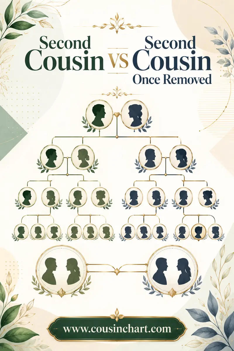
Half relationships. Half relatives share roughly half the expected DNA, moving them down a band. Always keep the half version of each candidate on your list — forgetting to is one of the most common reasons people misidentify a match, and it's a big part of why second cousins and second cousins once removed get confused with one another.
Common Mistakes With the Shared cM Chart
- Treating the average as the expectation. Your first cousin is far more likely to share something other than exactly 850 cM.
- Accepting the company's predicted label. It's generated from cM alone and picks the statistically most common option, which is often not yours.
- Forgetting half and removed variants. They're on the chart for a reason.
- Ignoring the zero floors. A missing fourth cousin is expected, not evidence of a wrong tree.
- Comparing cM across companies. Different thresholds and filters produce different totals for the same pair.
- Stopping at the chart. The chart produces a shortlist. Ages, sides, clusters, and documents produce the answer.
FAQ
What is a shared cM chart?
It's a reference table showing how many centimorgans of DNA each family relationship typically shares, with an average and an observed range for each. The standard version is the Shared cM Project, built by Blaine Bettinger from tens of thousands of documented relationships and hosted interactively at DNA Painter.
Can a shared cM chart tell me my exact relationship to a match?
No. Every cM value fits several relationships because the ranges overlap, and the chart is designed to return a list rather than a single answer. Age, which side of the family the match falls on, shared matches, and segment sizes are what narrow the list to one.
Why can't I tell a half sibling from a grandparent or an aunt?
All three relationships share about 25% of their DNA, roughly 1,300 to 2,300 cM, and there's no cM value that separates them. Age is usually decisive. Fully identical regions distinguish full siblings from everything else, and X-chromosome matching can rule out some configurations, but both require a company with a chromosome browser.
How accurate are the Shared cM Project numbers?
They're the best data available and widely trusted, but they describe reported results rather than fixed limits. Unusual results outside a published range do occur. The dataset also under-represents endogamous populations, so it reads too close for people with heavily intermarried ancestry.
Do all DNA companies use the same cM values?
No. Minimum segment thresholds, genetic maps, and filtering algorithms differ between companies, so the same pair of people can show somewhat different totals at different sites. AncestryDNA's Timber filter typically produces slightly lower totals for distant matches than other services.
What should I do if my number fits five relationships?
Work the filters in order: eliminate options with birth years, determine which side of the family the match belongs to, check shared matches for a cluster you recognize, and look at the longest segment to judge how recent the connection is. Then test the surviving hypothesis against records.
Get Your Shortlist in One Click
A shared cM chart is a shortlist generator, and it's excellent at that job. The number tells you which relationships are possible; ages, sides, shared matches, and segment shape tell you which one is yours. Work in that order and the ambiguity that frustrates beginners turns into a manageable process of elimination.
Have a number to check? Enter it in our free DNA match calculator and you'll get every relationship consistent with it, laid out clearly — the exact starting point for everything else in this guide.