Pedigree Chart Explained: How to Read and Make One
A pedigree chart is a diagram of one person's direct ancestors — parents, grandparents, great-grandparents, and so on — with everyone else left out. No siblings, no cousins, no aunts. Genealogists use it as their standard working document; geneticists use a symbol-coded version to trace inherited traits; breeders use it to document bloodlines. Same idea in every field: one individual at the root, ancestry fanning out behind them.
This guide explains how to read a pedigree chart, the numbering system that makes big ones navigable, the genetics symbols (squares, circles, shading), and how to start your own. When your research turns up relatives who don't fit on a pedigree chart — cousins, mostly — the free family relationship calculator on our homepage tells you exactly how they connect.
Relationship quick-check: tap a phrase to see the correct term — and whether they belong on your pedigree chart.
Tap a phrase above to see the answer.
Work out any family relationship →What makes a pedigree chart different from a family tree
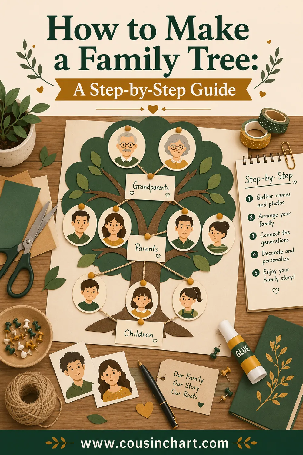
People use "family tree" and "pedigree chart" interchangeably, but the difference is precise and useful:
| Pedigree chart | Family tree | |
|---|---|---|
| Shows | Direct ancestors only | Ancestors plus siblings, cousins, spouses |
| Shape | Doubles each generation: 1, 2, 4, 8, 16 | Irregular, bushy |
| Direction | One person, looking backward | Often one couple, looking forward and sideways |
| Used by | Genealogists, geneticists, breeders | Families, reunions, classrooms |
| Structure | Rigid — every slot predetermined | Flexible |
The rigid structure is the pedigree chart's superpower. Because every person has exactly two biological parents, the chart's shape is identical for every human on earth: one box for you, then 2, 4, 8, 16, 32... That predictability means the whole document can be navigated by number, filed, and cross-referenced — which is why archives and genealogy societies standardized on it.
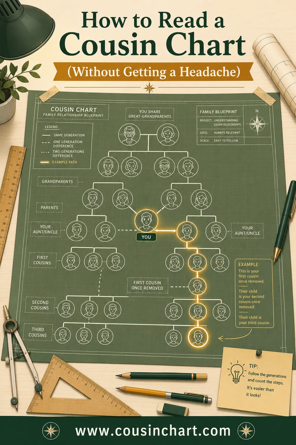
The vocabulary that goes with this: your direct line (ancestors) versus your collateral line (relatives who share your ancestors without being your ancestors — siblings, aunts, uncles, all cousins). Pedigree charts hold the direct line only. Collateral relatives are what our cousin chart — and the calculator itself — are built for.
How to read a pedigree chart
Genealogy pedigrees are usually drawn sideways: root person at the left, ancestry branching to the right, one column per generation. Three reading rules cover almost everything:
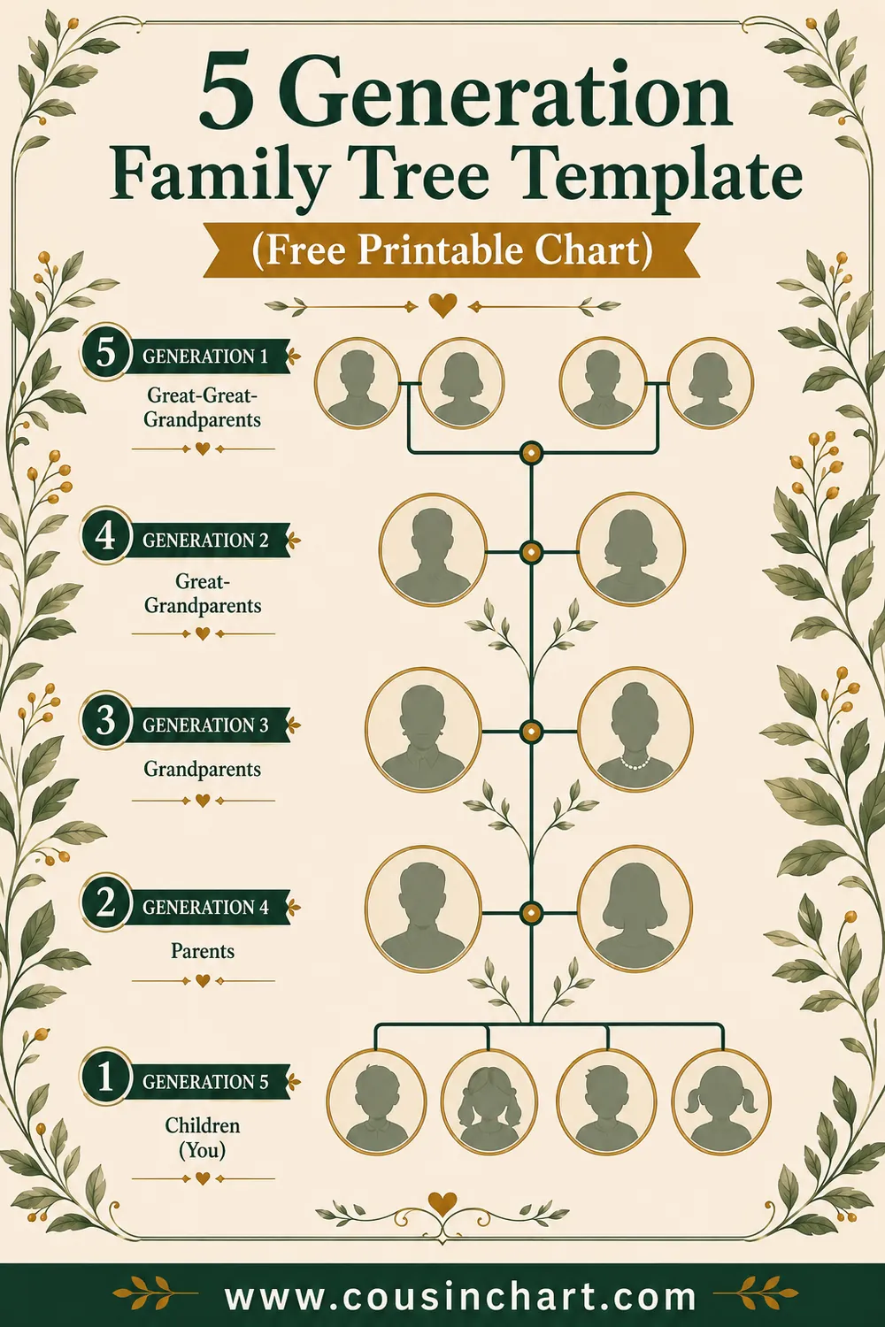
- Each column is one generation. Column 1 is the root person, column 2 their parents, column 3 grandparents, and so on. A "5-generation chart" has five columns and 31 slots — the standard single-page format (grab our free 5-generation template to see it laid out).
- Fathers above, mothers below. From any person's box, the upper branch leads to their father and the lower branch to their mother. Follow only upper branches and you're walking the strict paternal line; only lower branches, the maternal line.
- Each box holds the vital facts: name (surname in CAPS, maiden names for women), birth date and place, marriage date, death date and place. Abbreviated b. / m. / d.
The ahnentafel numbering system
Serious pedigree charts number every position, using a system called the ahnentafel ("ancestor table" in German). It's beautifully simple:
- The root person is #1.
- Any person's father = their number × 2. Any person's mother = their number × 2 + 1.
- So: father #2, mother #3, paternal grandfather #4, paternal grandmother #5, maternal grandfather #6, maternal grandmother #7 — and men always land on even numbers, women on odd.
The payoff: the number alone tells you exactly who someone is. #12? Even, so male; halve it repeatedly — 12 → 6 → 3 → 1 — and you've walked child-ward: #12 is the father of #6, who is the father of #3, your mother. So #12 is your mother's father's father. No labels required, and the system extends to any depth: your 16 great-great-grandparents are always #16–31.
The genetics pedigree: squares, circles, and shading
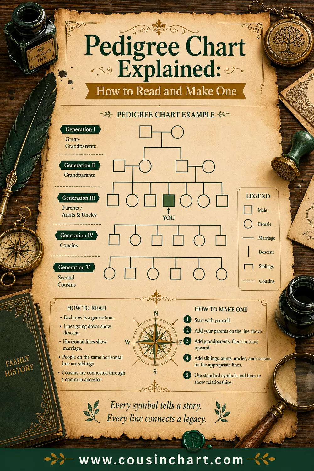
In biology class and genetic counseling, "pedigree chart" means something visually different — a diagram for tracing an inherited trait through a family. The information runs top-down (oldest generation at the top), and the symbols are standardized:
- Square = male, circle = female.
- Horizontal line between two symbols = a couple; a vertical line down from it leads to their children, arranged left-to-right by birth order.
- Filled (shaded) symbol = the person expresses the trait or condition being traced.
- Half-filled or dotted symbol = a carrier — one copy of a recessive gene, not expressing the trait.
- Diagonal slash through a symbol = deceased. Roman numerals label generations (I, II, III); individuals are numbered within each generation (II-3 = third person in the second row).
Geneticists read these charts to determine inheritance patterns: a trait appearing in every generation suggests dominant inheritance; a trait that skips generations and appears in children of unaffected carrier parents suggests recessive; a trait affecting mostly males hints at X-linkage. If a genetic counselor ever asks about your "family pedigree," this is the chart they'll sketch — and it's why knowing your blood relatives' health history (and exactly how they're related to you) genuinely matters.
Note the shared logic with the genealogy version: only biological lines count. A step sibling or adoptive relationship is drawn differently or annotated, because the chart's whole purpose is tracking what genes flow where.
Pedigree collapse: why the doubling eventually breaks
The math of a pedigree chart hides a famous paradox. Doubling every generation means 10 generations back you have 1,024 slots, 20 generations back over a million, and 30 generations back more than a billion — comfortably exceeding the population of medieval Europe. The resolution is called pedigree collapse: go back far enough and the same ancestors occupy multiple slots on your chart, because distant cousins married each other constantly (in a village of 300 people, nearly everyone was some kind of cousin). On paper, one real person can legitimately fill boxes #38 and #52 at once.
For a beginner this is mostly a fun fact, but it has one practical edge: don't panic if two branches of your research converge on the same couple. That's not an error — it's your chart being honest about how human populations actually work, and it's the pedigree-chart version of the double cousins phenomenon.
How to make your own pedigree chart
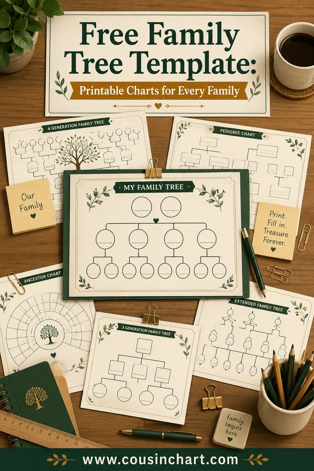
- Print a blank chart — our free family tree template collection includes 4- and 5-generation pedigree layouts sized for home printers.
- Put yourself in position #1 (or your child, if you want the chart to serve the next generation — everyone shifts one slot deeper).
- Fill from the known to the unknown: you, parents, grandparents, then verify great-grandparents with relatives and records. FamilySearch and the US census are free and cover most 20th-century American lines — the full source list is in our genealogy for beginners guide.
- Follow the conventions: surnames in CAPS, maiden names, unambiguous dates (4 Jul 1898), pencil until proven.
- Continue past the page with cascading charts: each person in the last column becomes #1 on their own new chart, cross-referenced by chart number.
One warning from every genealogist who's learned it the hard way: verify the link before you write the name. A pedigree chart has no room for "close enough" — if the person in box #10 is actually a step-parent or a granduncle, everything you attach above that box belongs to someone else's ancestry. When a relative's connection is fuzzy — "he was your grandmother's cousin, or maybe her uncle?" — run the exact path through the free relationship calculator first and place them (or exclude them) with confidence.
FAQ
What is a pedigree chart in simple terms?
It's a diagram of one person's direct ancestors only — parents, grandparents, great-grandparents, and so on. Siblings, cousins, aunts, and uncles are left off. The shape doubles each generation (2, 4, 8, 16), which makes the chart identical in structure for every person.
What's the difference between a pedigree chart and a family tree?
A pedigree chart shows only your direct ancestral line; a family tree can include everyone — siblings, cousins, spouses, descendants. Pedigree charts are rigid and numberable; family trees are flexible and bushy. Genealogists typically keep both.
How does the numbering on a pedigree chart work?
By the ahnentafel system: you are #1, anyone's father is their number doubled, and anyone's mother is double plus one. Men land on even numbers, women on odd. Position #6, for example, is always your mother's father.
What do the squares and circles mean on a pedigree?
In genetics pedigrees, squares are males and circles are females. A filled symbol means the person shows the trait being traced; half-filled means carrier; a slash means deceased. Couples connect with horizontal lines, and their children hang below in birth order.
Do cousins appear on a pedigree chart?
No. Cousins are collateral relatives — they share ancestors with you but aren't your ancestors, so they have no slot on a pedigree chart. To work out how a cousin connects, use a cousin chart or the free relationship calculator, which names any relationship from shared ancestors.
How many generations should a pedigree chart have?
Five generations (31 people) is the standard single-page format — deep enough to be useful, large enough to write in. Longer lines continue on cascading charts, where each last-column ancestor starts a new page as position #1.
From your direct line to every connection
A pedigree chart answers one question with total clarity: where do I come from? One box per ancestor, numbered, provable, expandable forever. What it deliberately ignores — the cousins, the grandaunts, the whole glorious collateral crowd — is the other half of family history, and that's the half the free CousinChart relationship calculator handles. Print the chart, fill your direct line, and when someone at the reunion claims to be your third cousin once removed, you'll be able to check them in ten seconds flat.